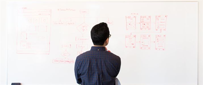
Throwback to 2016 when Vish attended a engaging course in London looking at UX to see how as a business we could apply the principles of UX to online businesses. Vish learnt plenty of new techniques which since then as a business have been actively using on an everyday basis. The course gave us a better understanding of what UX means and how it could work in the context of a business by making websites work better to convert queries into real sales.
Day 1
Looking at what is UX Design is
This was all about a user centred design process based around the user journey and related behaviour. It is used to improve your chances of meeting user needs as they navigate your site to create a great end product that sells.
How?
The aim was about putting UX methods and techniques to the test to improve a real website or app.
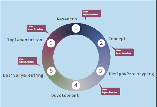
Shows a common life cycle in UX.
Our approach
First things first, with the other course members from all across the globe i.e. Scotland, Belgium and Saudi Arabia, we picked an app/website to identify improvements and suggest development improvements. This was pretty tricky as it’s harder than you think to find a bad app as you tend to swipe them off your phone pretty quickly, so in the end we went with an app which we felt could be improved i.e. Google Maps.
We decided there were a few improvements on Google Maps (app) which we could work on. As a group we felt the experience on the web was far more superior than on the app – Yes! even Google can be improved and you will soon see how.
Research
Gathering user data is the most critical stage of the cycle as each method and technique is based on research and it’s important that no assumptions are made.
I believe if you put good things in, good things will come out.
“User research focuses on understanding user behaviours, needs, and motivations through observation techniques, task analysis and other feedback methodologies.” (Usability)
Undertaking this helped us make informed decisions on design requirements.
Goals
Simple: What are you trying to find out from your research?
Techniques
There are two types of research Quantitative which is statistics/closed questions and Qualitative which is open and descriptive; it’s important to use a mix of both methods to get a rounded result.
Here are some of the key methods used by both:
- Observation- this can be a very useful exercise as you can see exactly how the user interacts with the product (Qualitative).
- Field Interviews- one on one interviews in the user’s natural environment (Qualitative/ Quantitative).
- Phone Interviews- cost effective as it can be done from anywhere in the world (Qualitative/ Quantitative).
- Surveys- tends to be closed questions, can be sent out to larger groups (Quantitative).
- Focus Groups – involves more than one participant, usually 6 plus are asked to share and discuss their thoughts on a topic which is moderated by a leader (Qualitative/ Quantitative).
We choose the Observation technique
Our main source of research for our team came from the ‘observation’ method. We wandered the streets of London, with one being the user, trying to navigate across London. We also looked at user ratings and comments from the app store giving us a mixture of both methods.
Two people took notes of their actions including what they are saying etc.
Two people on video- One from afar and one close up of how they are using the app, using the audio aids as a backup to written notes. There are now clever apps/software which can record user interaction e.g. Lookback
We lost signal, where do we go?.Where’s a superhero when you need one!
See more about when to use which techniques and what could work for you at nngroup
All the data?
You have the data, what’s next?
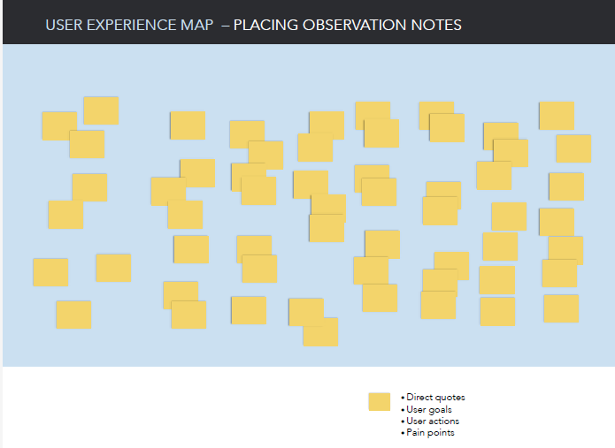
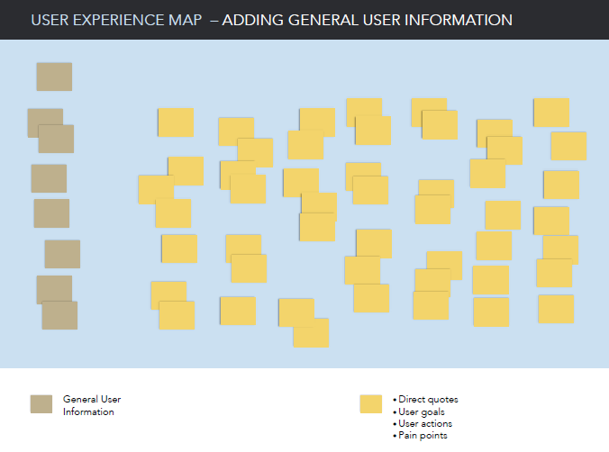
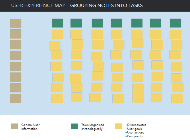
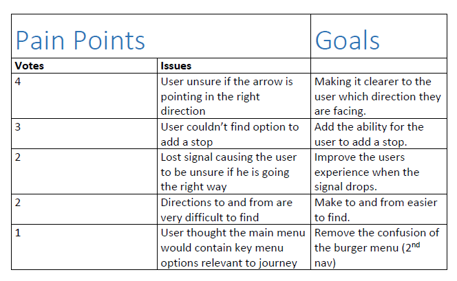
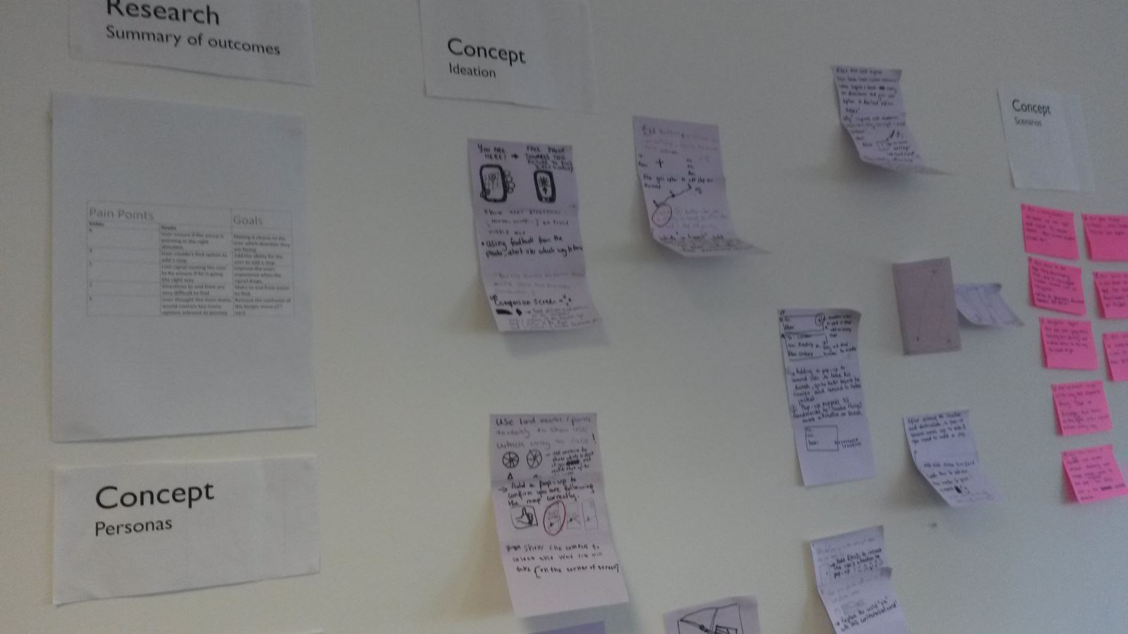
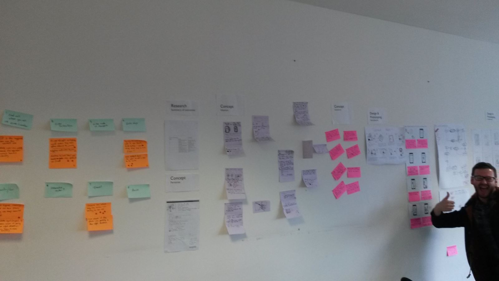
We created a user experience map, we placed each observation on one post it note and then placed them on thinking boards. From this the task we are Extracting Pain points, to simplify UX the problems.
Step 1:
Step 2:
Step 3:
Step 4:
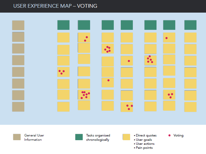
Step 4, Voting allows you to see which pain points take priority, this could be important in a tight budget where somethings may have to be looked at in phase 2.
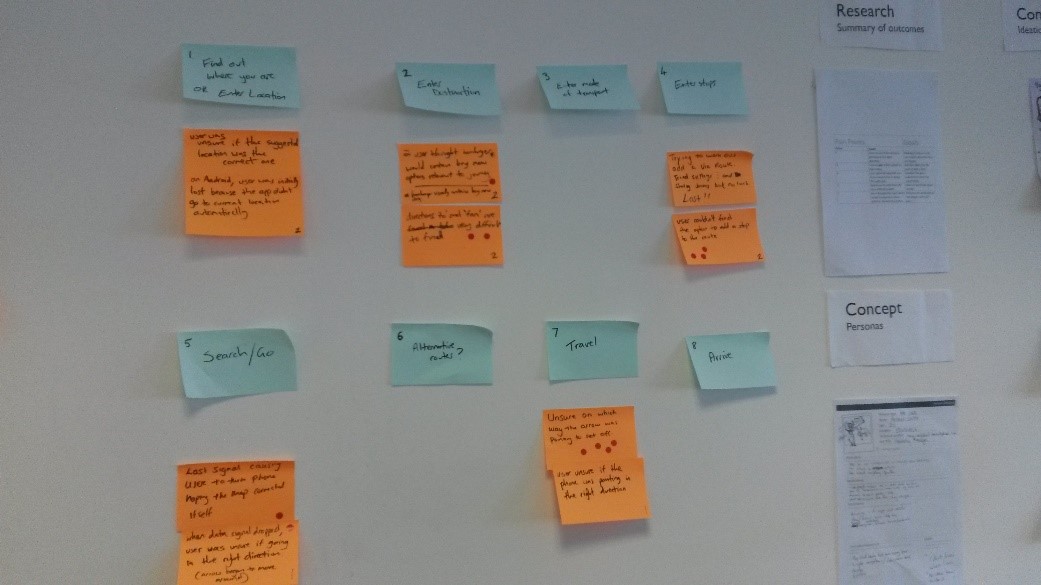
The end result – user experience map
From the pain points we created goals, which gave us direction and focus and from here we created solutions. What do think of some of solution issues we found?
End of day one and we have our goals.
Day 2
Personas- This method is used to identify and understand your user groups and target market. It’s a fictitious identity, which helps you through the user journey from their point of view. This way your approach will be more subjective in line with the persona.
You would have gathered most of your data to create a persona from the research stage. Personas allow you to understand how the user will interact with your product. To see further how to apply this to UX See Web Design
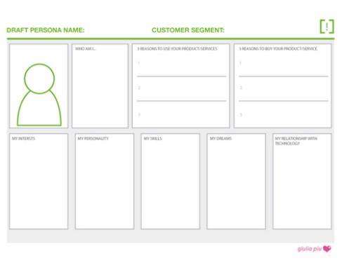
No set way of doing a persona but here is an example Template
Ideation
Using the findings from the previous day, we used several methods to come up with ideas to arrive at a solution.
Brainstorming- I won’t cover too much on this as almost all of us would have done this at some stage, a common practice being mind maps, writing down every idea you have and connecting them together.
Brain writing- This was a completely new to me but I loved it. No need to shout ideas out, even that shy individual in your team can get their ideas heard.
How it works – in a group, each person writes down or sketches the beginning of an idea to solve one of the pain points we came up with earlier, silently on a piece of paper.
This can be as simple or as complex as you wish, there is a time limit which means you use the first thing which comes into your head…we used 3 minutes per switch. When the times up, you pass on your idea to the person next to you, 3 minutes starts again and now you have the time to read someone else’s idea and add to it.
You do this till you get your idea back, when you do you can see how far its progressed. You do this for each pain point, which will lead to finding your perfect solution.
A simple idea but for me a great one, not everyone thinks the same way, someone else’s idea might trigger something in your brain so you end up with a great solution. It will also test those who think their way is the right way as once they see the improvements to their original idea, they would be more likely to accept changes, so I felt it’s a great way to come up with ideas.
These are only a couple of ideation generation methods; there are many more from the questioning and picture prompts etc. Examples found here
As we had five pain points, at the end of ideation we had more than one possible solution for each, we had a group discussion to finalise options before the next step. If you liked the idea of brain writing here’s some more information on the topic
Scenarios & Storyboards
We grouped the related pain points into two groups and from this we came up with two scenarios of when the solutions may be called upon and how it would work.
“Scenarios describe the stories and context behind why a specific user or user group comes to your site. They note the goals and questions to be achieved and sometimes define the possibilities of how the user(s) can achieve them on the site.” (Usability)
We read out each scenario step by step to make sure nothing obvious was missed, someone else may think in a different way so it’s important to do this.
Turning the scenarios into a visual representation, showing how the user interacts with the software and with their surroundings which you might not be able to get across with just text.
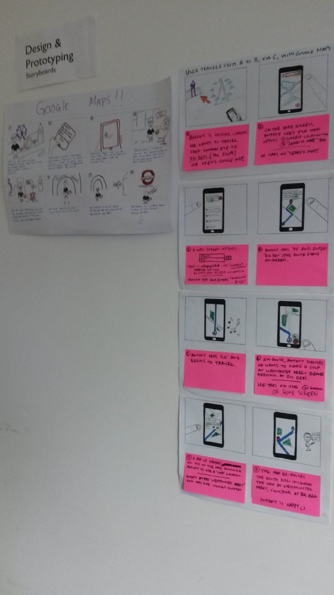
As in Blue Peter: some I created earlier
Day 3
Flow charts- breaks down to a lower level to analyse and see how the solution and process will work with user interaction. This can also be useful for the coder to understand what they are implementing and how it’s expected to display the information in a logical way.
Questions answered by your flow chart.
- What will the user be able to do? Are there limitations?
- What feedback will the user see or expect? Should there be more?
- How many steps to complete the process? Is it more than expected, why?
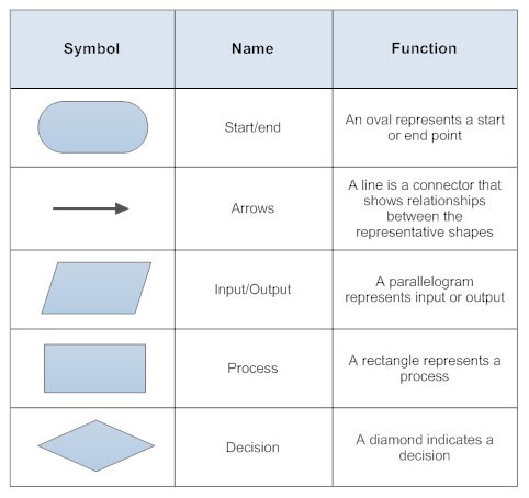
Starter pack of symbols required
Again there are many other methods commonly used from dataflow diagrams to use cases, the list goes on, it’s what you feel you will be the most beneficial out of them all and methods the others can easily understand.
Wireframes
Like a buildings blueprint, it’s the same basis but for a website or app, we already do a lot of this at Satori Membership Management using a software called balsamiq . The wireframe shows the screen layout or arrangement of the application’s content, including interface elements and navigational systems, and how they work together.
It’s important to let clients know that font styles and text won’t reflect the exact look of the site, since the aim of the wire frame is looking at functionality, content showing, feedback. If this is a concern and you trust your drawing skills, this could be done to avoid client confusion but make sure you develop a structure that your users will understand. Paper is also hard to collaborate and keep consistency throughout.
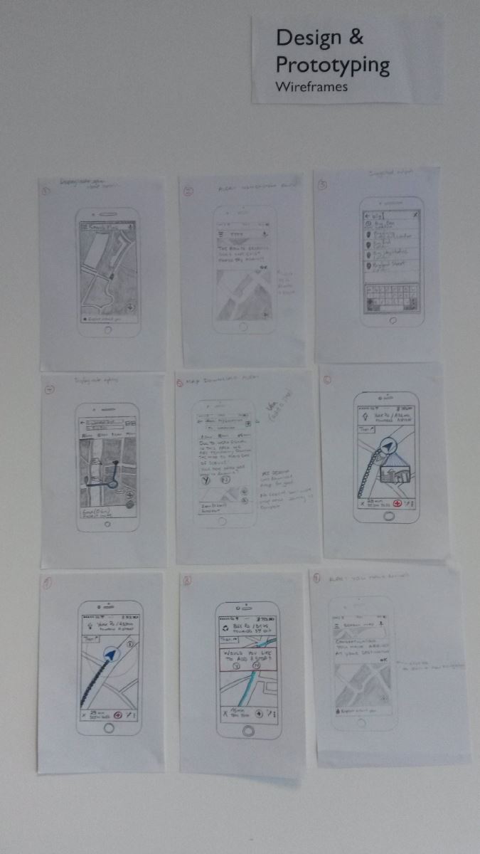
Maybe I will stick to balsamiq
Day 4
Prototyping
“A prototype is an almost realistic representation of what you are building. You can interact with it and test it on users in order to help validate your design. Prototypes can come in many forms. They can range from paper based sketches, clickable wireframes and even fully coded HTML applications.”
Why prototype?
You don’t want to spend time and money creating something which your client turns down. For a big project it’s a big risk to take.
- Help identify usability issues before going to code
- Get early user feedback
- Observe how users want to interact with your design
- Allow us to work out complex functionality or screen flows
- Faster to create than fully coded solutions (front and back end)
- Enable us to define the interaction design
There are two types of fidelity prototypes low/high, some say you should do low first then run usability testing, then using feedback from this to create high-fidelity. From my point of view, I feel high-fidelity is all you need, as low fidelity is completed on paper (clients don’t want to see my drawing capability) as mentioned before we have used Balsamiq for clickable wireframes which fall under the category Hi-fidelity and its always worked well.
Comparison
High-Fidelity
- Close to final version.
- Plenty of detail and functions
- Usability testing becomes more valuable as its close to the final thing, able to ask more questions and draw more feedback/ conclusions.
- Can take time to produce.
- Professional looking
Low-Fidelity
- Simple and quick to produce
- Early concept to see if logic is correct before moving on
- Sketchy and incomplete, would you show your art skills to your client?
A prototype won’t cover every part of a finished working system, so you are required to set tasks for your usability test.
Scene: You are in London, and you want to travel using google maps as a guide
Task 1: Travel from ‘London Eye’ to Big Ben using google maps
Task 2: During your journey, you decide that you want to make a stop at ‘Park Plaza’ hotel before arriving at big ben.
Day 5
We created the prototype using a website called Marvel (no not the superheroes) but a very easy to use application, and you can even create an app icon and have function based on clicks, swipes etc.
For our prototype we covered one of our scenarios which covered the following pain points.
-User couldn’t find option to add a stop
-Directions to and from are very difficult to find
Usability testing
We conducted usability tests to gain feedback on our solutions, first asking the user a basic set of questions to understand their level e.g. Interests, technology competency, hobbies etc. Then we set them loose with the tasks, the user hardly noticed the changes which is probably good thing as they went off without a hiccup and when we gave the user the same task to do on the current version of google maps, “Wow that’s not as simple as yours” and task 2 wasn’t even possible.
Examples of this can be found here….
It’s a thumbs up
Conclusion
I guess the problem with all this is the time it takes, as time equals money so it goes down to finding the components from UX design which will work for you to add value to your end product, and that’s where we are happy to help.
Also having access to willing users, without users the process falls short, which may be easy for some companies but not others. As Eurostar said they have a whole train station which they can use and find willing users, may not be so easy for the smaller business.
I found it was all about is it worth the extra costs to make sure you end up with a product you imagined, then spending all the money on something which isn’t close, that’s up to you.
From a course point of view, it was success the user was convinced by, so if Google wants to give us millions we won’t complain. Even though a lot of the concepts were known it was nice to tie them together and brainstorm, and bounce ideas off others in the business. I am now looking forward to putting what I learnt into practice at Satori Membership Management.

Location of the course was just by the London eye